All in all the project has been a good first experience of trying to meet industry standards on time. It has been a learning curve, and even though we dindt manage to finish the project on time, it has taught me lessons for the future, in terms of balancing workload with quality. I know now that we gave ourselves too much work to do in too little time, and we were realistically doomed from the start in terms of getting the work done. I was happy with the outcome of the project in the end though once it got finished, particularly the stylized effect we gave the piece, i think that worked very well, and gave our piece a stand out factor. I am also happy with the showreel i produced, although i came into problems when trying to burn and format the DVD, i ad no problems with the actual making of the showreel, which i found reassuring.
Other than making sure we don't take on too much work than we can cope with, in the future i feel i will learn from this project. I see this term as an opportunity well took to expand and apply those things i learned last term into a project. The term before this one was more about learning new techniques and practices, and this term was definitely more about applying them to a working environment.
In terms of team dynamics, i think we were very solid. Compared to last term where we had a group of 5 people, i think in the end we ended up getting on each others nerves by the end of it, however this was not the case this term, i felt me Josh and Depa built a very strong working relationship, which in truth i think is down to the fact that we are good friends anyway.
I feel i have made progress from last term and have proved to myself i can make things to industry standard, although i know there is a lot of room for improvement, however i have been invigorated with a boost of confidence which i know i will continue with throughout the summer and take into the third year.
Rendering to broadcast standards

Unlike any other projects i have done at college, with this one i had to ensure it met broadcast standards. I was given a Rave live manual which had a lot of information to scan through to ensure it was ready for broadcast submission so that it could be shown correctly on wide screen monitors, and other platforms. Also we must ensure our piece sticks to certain rules, for example no explicit content, and no adult themes, this is important to get right, otherwise our footage wont get through QC.
Info below is taken from Rave Live user manual...
Line-up, Test Signals, Leader and Clock
The start of programme and any subsequent part should be preceded by a countdown clock. This clock must include:
• The Production Number issued by your Heads of Post • The Programme Title • The Producer’s Name • SD or HD Master (Or SD copy of a HD Master)
• 16:9 Letterbox or 16:9 Full Height Anamorphic • Whether the audio is stereo or dual mono. • Start and End of Programme for example 10:00:00:00 - 10:20:00:12
The clock must provide a clear countdown of 20 seconds with the first frame of the programme laid back three seconds. All programmes must be 16:9 Letterboxed or Full Height Anamorphic (FHA)
It is essential that your programmes be correctly outputted onto Tape. Follow the Table below to correctly Line up and Lay off your Programme.
Video
• 625 lines • 50 fields per second interlaced • 16:9 aspect ratio, FHA preferred • Captions should be protected for 4:3 display (Use 4:3 Title Safe) • Both longitudinal time code (LTC) and vertical interval time code (VITC)
• Picture must be sharp, high quality and of ‘broadcast standard’
• Colours are a realistic representation unless otherwise intended
• Black & White crushing should be avoided
• Audio is of a high quality
• Avoid flashing and strobing images
• Content should be appropriate for afternoon broadcast at Rave Live 2010, and
therefore should not feature foul language, nudity, drug abuse, sexual
references or extreme violence.
• Nudity must be blurred or cut altogether
• Any foul language or swearing is cut altogether from that person’s speech
• No copyright infringement
Compositing
When i arrived at the compositing stage, i knew the project was nearly over, all that needed to be done was import all the rendered image files into AE, and add the effects and clip the whole thing together. I received 5 image files off Depa of the cut scenes with text which i needed to put into different places in the narrative to help progress the story. Once everything was in place, and the animation flowed well, i added an adjustment layer to the whole thing, and added a Hue/Saturation effect, clicked the colorize box, and decreased saturation to get a nice sepia effect to the whole project. I then imported the real time 8mm video footage i found on the internet, changed the layer type to 'Multiply' to get rid of all the white spaces within the footage, so only the black scratchy effect was left, then stretched the video over my own to play throughout as a separate layer. I also decided to include a separate image file right at the end of the sequence to prologue the time the Rave Live logo was seen on screen, so the last couple of seconds of the sequence is an image file, rather than a piece of rendered footage.
In my opinion i feel the process of compositing went very smoothly, however i ran into one problem. I originally made the AE project on the new CS5 programme, and couldnt render it because it was only a tester version. I then thought, oh ok ill just open it up on a college computer, and i couldnt, because the versions are not backdateable, and college computers only had CS4 versions of AE. This was nothing mroe than an inconvenience in the end, as i had left enough time to redo the project swiftly in one morning at college. I know for future now that this cant be done, and ill make sure it never happens again.
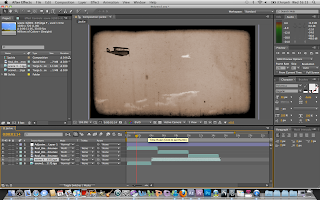
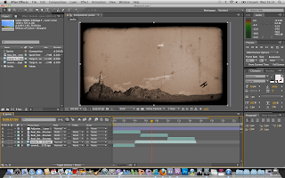
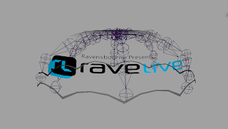
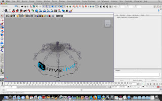
The images below show me implementing all the different aspect of our project into the same scene, just to test what the scene looked like, and whether they looked good together. Also this gave me the opportunity to scale each piece down to its appropriate and realistic size.

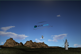
This video is of the 8MM footage played over the first scene, this is with the Hue/Saturation effect switched off.
In my opinion i feel the process of compositing went very smoothly, however i ran into one problem. I originally made the AE project on the new CS5 programme, and couldnt render it because it was only a tester version. I then thought, oh ok ill just open it up on a college computer, and i couldnt, because the versions are not backdateable, and college computers only had CS4 versions of AE. This was nothing mroe than an inconvenience in the end, as i had left enough time to redo the project swiftly in one morning at college. I know for future now that this cant be done, and ill make sure it never happens again.


The images below show me implementing all the different aspect of our project into the same scene, just to test what the scene looked like, and whether they looked good together. Also this gave me the opportunity to scale each piece down to its appropriate and realistic size.


This video is of the 8MM footage played over the first scene, this is with the Hue/Saturation effect switched off.
Selling Myself
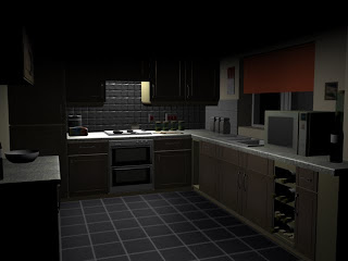
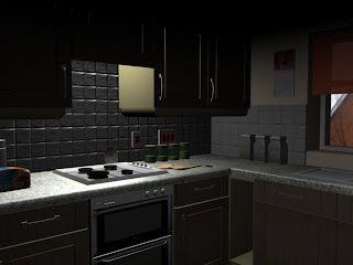
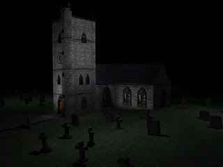
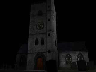
When i was speaking earlier about using my work i am most proud of, i decided to include a few pieces that are going on to my showreel. Below are examples of modeling, texturing and lighting, including last terms project of the church, which i decided to re light as the lighting that was previously on it didn't look realistic. I am particularly proud of the kitchen as this was made from scrap to finish by myself, meaning i did every stage of production, which i hadn't done very often previously.


What needs to be on a showreel?
I asked myself the question, what needs to be on a showreel, and what to employers look for when they are going through showreels...
Clear and precise Contact information
I made sure i included a whole section dedicated towards contact information which had my Full name and social and working contact emails on them, so that potential employers could easily contact me. I know this is very important to do, as employers do not want to waste their time searching around for contact information when they could be getting on with other things.
Your best work
In my showreel i must ensure that i only include my best works. There is no point putting work into my showreel that i am not proud of, or that is totally unworthy of being seen by employers, as it is better to show a small amount of excellent work, rather than a lot of 'poo' work.
Should you include unfinished work?
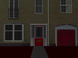
I was debating whether or not i should put unfinished work into my showreel (ie. work in progress) however i came to the conclusion that there was no point in doing so as most of the focus of my showreel is UV mapping and texturing work, and that generally means it is near enough finished if it is at that stage in production. Also i didn't have any work in progress i could include in my blog at that present time, however i am currently working on building my house in Maya, and i put certain finished aspects of that project in my showreel.
Life drawing and drawn concept work
I know that an important aspect of work that employers look for is concept work and life drawing, however i didn't have any of this i was particularly proud of, so i decided to exclude it for the time being. However, i know for a fact now this is something i must work on over the summer period to fill in the massive gaping holes in my portfolio.
Best work at the front
I think this mainly applies to video reels, however i implemented some aspects of this into my DVD menu display, with the top sections those i was most proud of.
Something that will stick in their minds
I dindt include so much of this for this project, however for when i start to send my showreel to future employers, i need to ensure i come up with a way for my showreel to stick in the minds of those people looking through them. The main reasons for this, is because the intake of showreels at studios must be immense, and looking through DVDs all day must become very same-ish and tedious, so having something to make you stand out above the rest and stick in the minds of the employer is vital, even if it is a decorated box, in fluorescent colours.
Sell Yourself not the Uni
Once i leave uni i wil be independant from the university, and my main focus is to promote myself, not my working institution, so there is no need for me to include only works that i done in university, I have got around doing this by including some of my own individual work, including work i did on work experience as well as work that i have been doing independently, building my own home in Maya.
Clear and precise Contact information
I made sure i included a whole section dedicated towards contact information which had my Full name and social and working contact emails on them, so that potential employers could easily contact me. I know this is very important to do, as employers do not want to waste their time searching around for contact information when they could be getting on with other things.
Your best work
In my showreel i must ensure that i only include my best works. There is no point putting work into my showreel that i am not proud of, or that is totally unworthy of being seen by employers, as it is better to show a small amount of excellent work, rather than a lot of 'poo' work.
Should you include unfinished work?
I was debating whether or not i should put unfinished work into my showreel (ie. work in progress) however i came to the conclusion that there was no point in doing so as most of the focus of my showreel is UV mapping and texturing work, and that generally means it is near enough finished if it is at that stage in production. Also i didn't have any work in progress i could include in my blog at that present time, however i am currently working on building my house in Maya, and i put certain finished aspects of that project in my showreel.
Life drawing and drawn concept work
I know that an important aspect of work that employers look for is concept work and life drawing, however i didn't have any of this i was particularly proud of, so i decided to exclude it for the time being. However, i know for a fact now this is something i must work on over the summer period to fill in the massive gaping holes in my portfolio.
Best work at the front
I think this mainly applies to video reels, however i implemented some aspects of this into my DVD menu display, with the top sections those i was most proud of.
Something that will stick in their minds
I dindt include so much of this for this project, however for when i start to send my showreel to future employers, i need to ensure i come up with a way for my showreel to stick in the minds of those people looking through them. The main reasons for this, is because the intake of showreels at studios must be immense, and looking through DVDs all day must become very same-ish and tedious, so having something to make you stand out above the rest and stick in the minds of the employer is vital, even if it is a decorated box, in fluorescent colours.
Sell Yourself not the Uni
Once i leave uni i wil be independant from the university, and my main focus is to promote myself, not my working institution, so there is no need for me to include only works that i done in university, I have got around doing this by including some of my own individual work, including work i did on work experience as well as work that i have been doing independently, building my own home in Maya.
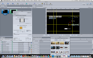
Creating a showreel
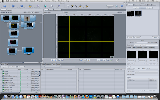
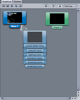
The showreel was the other part of its terms project, we were told we needed to produce a professional looking showreel and submit it on to a DVD format disc so that it plays as a DVD. After we had one tutorial on the software, we were expected to get on with it. At first i found the software a little confusing but after about half an hour playing around with it i started to get the hang of it. I then had a decision to make. I could either produce a showreel as an edited piece of video and then submit it on a DVD so it plays directly off of it, or i could produce an interactive sectioned DVD which displayed different areas of my work more clearly and precisely. I went with the second option. i divided my shoreel into five sub section menus of, Modelling, Texturing, Lighting/Art, Animation and Contact details. At this stage i was thinking of placing my best work at the top menu of the showreel, so in this case i put texturing at the top of my menus, as this is the area i feel most confident in.
After creating the sub menus, i began to add tracks for videos and other menus to display other work i had produced. I had to make sure i linked each menu back to the root menu, so that the user would not get lost in the interface. All in all i felt my menus were very easy to use, evne though i opted to use Back buttons allowing the videos to loop continuously, rather than automaticly linked back tracks which linked to the previous menu after one play.
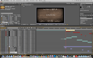
One of the individual touches i added to my showreel was creating colour coded and animated menus in after effects which i then bought in to the DVD studio pro software. i thought this worked very well, allowing the user to interact with the colour coded menus easier and more efficiently. I also created individual overlays for the buttons as PSD files in Photoshop. This allowed me to tint the button with a specific colour as the user scrolls over a particular button or image. This made the whole interaction process easier, and let the user know what button he was at on the menu if he was using a DVD player with a remote control rather than a mouse on a computer.
I was rather proud of my showreel for a first attempt, and i very much enjoyed the process of making it, i do however feel that in the future i cn customise my menus a little more, to cement my own specific style to the piece a little more effectively.
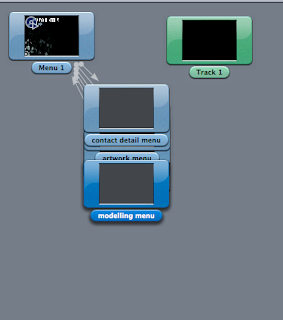
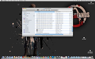
The image below shows the first stage in the showreel process, i had to cherry pick my best work form the last two years and import them all on to one hard drive, and divide them all into sections ready for importing into Studio Pro.
Below are examples of the AE work i did for colour coding my menus.
After creating the sub menus, i began to add tracks for videos and other menus to display other work i had produced. I had to make sure i linked each menu back to the root menu, so that the user would not get lost in the interface. All in all i felt my menus were very easy to use, evne though i opted to use Back buttons allowing the videos to loop continuously, rather than automaticly linked back tracks which linked to the previous menu after one play.
One of the individual touches i added to my showreel was creating colour coded and animated menus in after effects which i then bought in to the DVD studio pro software. i thought this worked very well, allowing the user to interact with the colour coded menus easier and more efficiently. I also created individual overlays for the buttons as PSD files in Photoshop. This allowed me to tint the button with a specific colour as the user scrolls over a particular button or image. This made the whole interaction process easier, and let the user know what button he was at on the menu if he was using a DVD player with a remote control rather than a mouse on a computer.
I was rather proud of my showreel for a first attempt, and i very much enjoyed the process of making it, i do however feel that in the future i cn customise my menus a little more, to cement my own specific style to the piece a little more effectively.


The image below shows the first stage in the showreel process, i had to cherry pick my best work form the last two years and import them all on to one hard drive, and divide them all into sections ready for importing into Studio Pro.

Below are examples of the AE work i did for colour coding my menus.
Balancing the projects
With the Rave Live project aimed at actual clients, we knew we had more of a responsibility this term. Although we were not able to complete the project to the desired time set out, i did learn a lot about balancing two projects at the same time. I knew that the rave live project was due before the showreel, so the initial plan was to focus on the rave live brief for the first 4-5 weeks and then use the remainder of the time of term to focus on the showreel project. However this did not end up being the case. We found ourselves setting too much work to complete within a too short time span, and i do regret this.
In future i would definitely look to set ourselves a shorter work load, as i do not think it is the case that we worked too slow, rather i think we set ourselves too much to cope with. Cutting down the animation definitely helped us complete the project however it did have a detrimental effect to the quality of our work.
The showreel project helped that the software was very easy to use, and compiling the showreel didn't take very long at all, and i managed to do ti all within a few days from start to finish, including compiling all the information needed to go into the reel, and i was very happy about the outcome of that project with the exception of the render out which didn't work due to technical difficulties, however i look at it in a positive light, as i wouldn't be showing my employers that work in the end anyway, and by the time i go out looking for work in the industry, my showreel would be of a much higher standard.
TESTING

When testing lighting for my project, we wanted to create a balanced and even light which would allow the details of the scene to be played around with easier in AE. By doing it this way it would give the piece a more smooth and even feel and allow the sepia to be added to greater effect.
The final render didnt go as well as i would have liked, however, the backdrop to the scene was lit very nicely. The foreground where the character floats down however has too hard light in my opinion. This is what i would change if i was to do it again.
Test Scenes
This scene i rendered to show what the after effects treatment would do the the final render, i wanted to show the plane falling down in a cloud of smoke as this is one of the more detailed scenes that i was most proud of. I like the way the scene looks, and i decided to keep it this way for the final version.
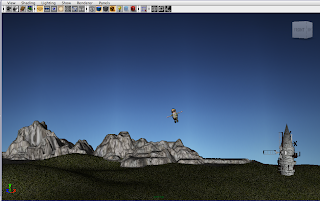
I decided to test out some very rough renders in the early stages of production, just to see if our storyboard idea flowed well. I decided to render out a rough version of the very first scene, with no effects on it, and it came out nicely. For this scene however i didn't include the skydome, but i included a rolling background scene of clouds and sky which i made in Photoshop. I like the way the scene came out all but for the rolling sky rather than the skydome. I knew from this point on that we had to look towards having a skydome to make the environment look more realistic.
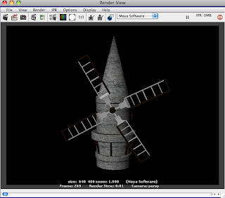
This sequence is a short demonstration of the movement of the windmill, i wanted to to a quick video showing i had thought about the background animation to help add a realism to the scene which is the main reason for the inclusion of background architecture.
I like the way the windmill frames the whole scene, diverting attention on to the other side of the screen, ready for the action to take place.
This scene is a scene i did to test the look and feel of the 8MM film reel just after coming up with the idea as a group. I wanted to get an initial feeling of whether or not it would look good and i thought the best way to do this would be to do a quick test render with the film as an overlay.
Texturing
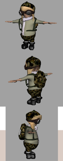
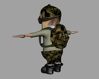
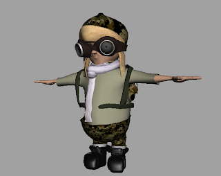
Texturing is the section were most of the emphasis of my work was focused on. I textured the character model, the biplane, the windmill and the parachute, and looking at the finished outcomes i am very happy with the outcome of my work. I particularly feel that the character texture works very well. In the beginning i was aiming for a mixture between an aviation fanatic and an army fanatic. i feel the camouflage textures, mixed with the aviation hat and goggles makes this piece work very well. I applied very appropriate colors of khaki and army green throughout the piece, keeping it in sync with he style of the traditional army.
The windmill i decided to texture using very traditional white/light brick. I wanted to keep it in sync with the rest of the piece. I am happy with the outcome of these textures, i feel the neutral colous of grey and brown work very well to keep it within the time period of the biplane.

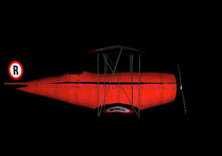
the textures of the biplane were a little different to the rest of my textures. I wanted to add a personal touch to the biplane as it would be the main focus of the scene. i decided to add the Ravensbourne logo to the plane, before the logo change which came after i had produced the plane. I wanted to keep the plane bright colours in consistency with my research, and keep it in running with the colours of the Ravensbourne logo, so the obvious choice for colour was red.
With most of the biplanes i saw from my research, i saw they were constructed with metal panels, fixed together with screws, so i decided to replicate this effect within my texturing. I feel the aesthetic outcome of the piece is a good one, and i am very happy with it.

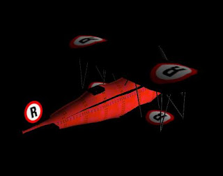
I created the parachute with the Rave Live logo on it, i thought this would be the obvious way of promoting the event within our animation, as it would be such a large and pivotal image on the screen during our scene, drawing the main focus of attention to it. I created it using a transparent layer in photoshop, which i then applied as a texture in Maya, i made the trim of the parachute translucent to give it some obvious shape as a parachute.
This was my first experience of using alpha channels as textures and i am happy with the outcome of the textures, i feel it gives the parachute a nice look to it, with also a cartoony added aspect which matches the character design.

Animation and how we fit in.
Myself and Depa had the responsibilities of animating the piece. We started far too late in the production which i was annoyed about, but we couldn't do anything to help it, other than pre planning a little better. Once we had missed the Rave Live deadline, we had a week to start and finish animation, we knew that due to this short amount of time we had to cut out certain aspects of our animation.
Originally our animation included several cuts, with close ups of flying along with the biplane at very cantered angles, we come to an executive decision that these needed to be cut in order to finish out piece.
We also wanted to include some animation on our character Jack, with the flaps of this hat flying around with the wind, and with him walking off screen at the end of the scene. We also intended to rig the parachute so that it could fold up in a natural way, once it had landed on the ground, however this also had to be cut.
We got on with the animation with our pushed time limit, and it all went very smoothly, we were able to complete it in a couple of days. We had 3 scenes in total to animate, i took responsibility for the first scene, and the scene where the plane falls out the sky, which were the two shorter scenes. Depa took responsibility for the middle scene where the plane is flying through the sky, and the camera pans 180 degrees around the plane, and then the bird comes flying into the plane with it spinning out of control.
Looking back at the animation we did, i can safely say that in my opinion it looks very rushed, i feel we didn't give ourselves enough time to complete it, and the animation in some places looks very rusty and rushed, and in some places too slowly paced, and in some places, too fast paced, for example the part where the bird flies into the plane, i feel we could have dragged over a longer period of time.
If i was to do this project differently, i would have definitely given us at least 2 weeks to animated the piece, this would have allowed us to include those pieces we had to leave out, and would have given the whole project a more professional feel.
 \
\
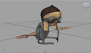
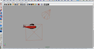
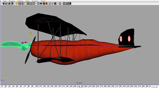
These screen shots are of me animating my chosen scenes, we decided to animate the plane first, because if we imported a character and animated them together it would lag the computer a huge amount making animation nearly impossible. We had some problems with this however. We were not able to parent the plane to the character so that it stayed in the cock pit, so in turn we had to animate the character separately, which makes it look very awkward, with the character seeming to bounce out of his seat unnaturally, however i couldn't do much to change this at such a late stage in the project.
We needed to find an angle that looked good for the plane to fly into the plane. Originally we were going to have him fly in form the side profile, from the storyboard, however now that we added the 180degree pan, we decided to have him flying in from the top left of scene, tipping the plane off into a spiral. I fell doing this gave the piece a much more realistic and professional feel.
How we fit in...
Throughout our project, we all had our own roles we had to stick to, we decided from the beginning that we would all produce our own separate storyboards, so that we could come up with the best idea put together. we then broke down each individual job role. I wanted to focus on UV and texturing this term, as well as a little bit of modeling. Depa stated her desires to produce some character modeling as that is a gap she had in her portfolio, so me and josh agreed to let her focus on the character model. Josh took responsibility of the sound, and modeling of the windmill, as well as producing the ground terrain and sky dome for the piece. We all recognized that we had our individual roles, however we all helped each other out when needed also. Once we were in post production, i agreed that i would render and compile our scenes and add effects to get the finished movie.
The animation pipeline is very important in a project like this. We all recognise we have our own responsibilities and we also all know where we fit in amongst each others job roles. For example, Me and Depa created storyboards as this was our part of production, and Josh did not produce one, however this was no problem at all as he knew where our project was heading by looking at our storyboards, and interpreting the information we had decided on to inform his own decisions about things such as the type of windmill he modeled. I think all in all we worked very well in this pipeline, and we were always in contact and had a great knowledge of what each one of us was doing.
Originally our animation included several cuts, with close ups of flying along with the biplane at very cantered angles, we come to an executive decision that these needed to be cut in order to finish out piece.
We also wanted to include some animation on our character Jack, with the flaps of this hat flying around with the wind, and with him walking off screen at the end of the scene. We also intended to rig the parachute so that it could fold up in a natural way, once it had landed on the ground, however this also had to be cut.
We got on with the animation with our pushed time limit, and it all went very smoothly, we were able to complete it in a couple of days. We had 3 scenes in total to animate, i took responsibility for the first scene, and the scene where the plane falls out the sky, which were the two shorter scenes. Depa took responsibility for the middle scene where the plane is flying through the sky, and the camera pans 180 degrees around the plane, and then the bird comes flying into the plane with it spinning out of control.
Looking back at the animation we did, i can safely say that in my opinion it looks very rushed, i feel we didn't give ourselves enough time to complete it, and the animation in some places looks very rusty and rushed, and in some places too slowly paced, and in some places, too fast paced, for example the part where the bird flies into the plane, i feel we could have dragged over a longer period of time.
If i was to do this project differently, i would have definitely given us at least 2 weeks to animated the piece, this would have allowed us to include those pieces we had to leave out, and would have given the whole project a more professional feel.
 \
\These screen shots are of me animating my chosen scenes, we decided to animate the plane first, because if we imported a character and animated them together it would lag the computer a huge amount making animation nearly impossible. We had some problems with this however. We were not able to parent the plane to the character so that it stayed in the cock pit, so in turn we had to animate the character separately, which makes it look very awkward, with the character seeming to bounce out of his seat unnaturally, however i couldn't do much to change this at such a late stage in the project.

We needed to find an angle that looked good for the plane to fly into the plane. Originally we were going to have him fly in form the side profile, from the storyboard, however now that we added the 180degree pan, we decided to have him flying in from the top left of scene, tipping the plane off into a spiral. I fell doing this gave the piece a much more realistic and professional feel.

How we fit in...
Throughout our project, we all had our own roles we had to stick to, we decided from the beginning that we would all produce our own separate storyboards, so that we could come up with the best idea put together. we then broke down each individual job role. I wanted to focus on UV and texturing this term, as well as a little bit of modeling. Depa stated her desires to produce some character modeling as that is a gap she had in her portfolio, so me and josh agreed to let her focus on the character model. Josh took responsibility of the sound, and modeling of the windmill, as well as producing the ground terrain and sky dome for the piece. We all recognized that we had our individual roles, however we all helped each other out when needed also. Once we were in post production, i agreed that i would render and compile our scenes and add effects to get the finished movie.
The animation pipeline is very important in a project like this. We all recognise we have our own responsibilities and we also all know where we fit in amongst each others job roles. For example, Me and Depa created storyboards as this was our part of production, and Josh did not produce one, however this was no problem at all as he knew where our project was heading by looking at our storyboards, and interpreting the information we had decided on to inform his own decisions about things such as the type of windmill he modeled. I think all in all we worked very well in this pipeline, and we were always in contact and had a great knowledge of what each one of us was doing.
Modelling
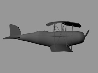
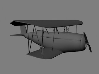
I took on a few modeling responsibilities within this project. From te start, i agreed to model the biplane, the rocky terrain, and the parachute.
Whilst modelling, i took into consideration the time periods of what i wanted the plane to come from. I aimed to get the plane looking not too modern, but not too old style, i looked towards the wartime style biplanes.
I am relativity happy with the outcome of my plane, however i feel that the tail of the plane could have had some more thought when it came to detail.
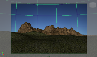
The terrain i modeled, was very simple, i just took a polygonal plane and extruded it out from the faces to give a rocky texture. I also bump mapped the texture at first, however it dindt look as good as just the simple projected texture. I felt it was nescessary to create a rocky terrain in orderto frame the scene and give it some sort of perspective of distance when the character and plane are in the scene.
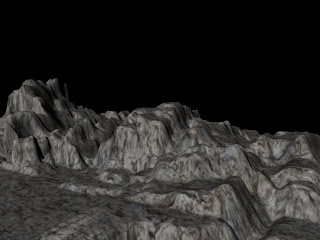
This image below shows what i was talking about before, about framing the scene. If the scene only had a grass plane and a sky, we wouldn't necessarily know the scale of the scene, it could be a few meters wide, or a few miles wide, i feel that including the rocky parts adds perspective to the whole thing.
I also modelled and rigged the bird, this was a very simple model, of a body and mirrored wings, we only needed a very simple bird as it would only be flashing across the scene rather than staying in focus, because of this i am happy with the outcome of the model, however if there was more emphasis on the bird, i would not have been happy with the very basic model, and i would have put more time and consideration to adding facial and wing detail.

The parachute was the second thing i modeled after the biplane. It was a simple sphere cut in half, and the edges tweaked to form a parachute shape. I was not too worried with the model of this as most of the emphasis would come from the texturing of the piece.
I looked into rigging the parachute with joints, as well as with deformers, however a change of plan in production allowed us to scrap this.
Whilst modelling, i took into consideration the time periods of what i wanted the plane to come from. I aimed to get the plane looking not too modern, but not too old style, i looked towards the wartime style biplanes.
I am relativity happy with the outcome of my plane, however i feel that the tail of the plane could have had some more thought when it came to detail.


The terrain i modeled, was very simple, i just took a polygonal plane and extruded it out from the faces to give a rocky texture. I also bump mapped the texture at first, however it dindt look as good as just the simple projected texture. I felt it was nescessary to create a rocky terrain in orderto frame the scene and give it some sort of perspective of distance when the character and plane are in the scene.

This image below shows what i was talking about before, about framing the scene. If the scene only had a grass plane and a sky, we wouldn't necessarily know the scale of the scene, it could be a few meters wide, or a few miles wide, i feel that including the rocky parts adds perspective to the whole thing.

I also modelled and rigged the bird, this was a very simple model, of a body and mirrored wings, we only needed a very simple bird as it would only be flashing across the scene rather than staying in focus, because of this i am happy with the outcome of the model, however if there was more emphasis on the bird, i would not have been happy with the very basic model, and i would have put more time and consideration to adding facial and wing detail.

The parachute was the second thing i modeled after the biplane. It was a simple sphere cut in half, and the edges tweaked to form a parachute shape. I was not too worried with the model of this as most of the emphasis would come from the texturing of the piece.
I looked into rigging the parachute with joints, as well as with deformers, however a change of plan in production allowed us to scrap this.


Storyboard

My storyboard was originally made in the first week of term, this is the kind of thing we had in mind form the first week. It starts with a biplane flying across screen,the clip then cuts to a medium shot of the plane flying along and all of a sudden a bird flies into it, causing it to spin out of control and out of scene. The scene then cuts to the plane falling through the sky, and a man floating down on a parachute. The camera stays stationary throughout, however it slowly zooms into the Rave Live logo towards the end of the film.
This storyboard allows a good range of animation in my opinion. The Rave Live logo also in terms gets its required amount of exposure, and our modeling/texturing and animation skills get shown as well which is a fair share of the credit i feel.
Research
After finding out my specific roles within production, i have narrowed down my areas of research. I have decided to look into different types of aviation gear and different types of biplane. I have been given the tasks of modeling the biplane, and terrain, and texturing everything within the scene, i will also be doing some animating, and composting.
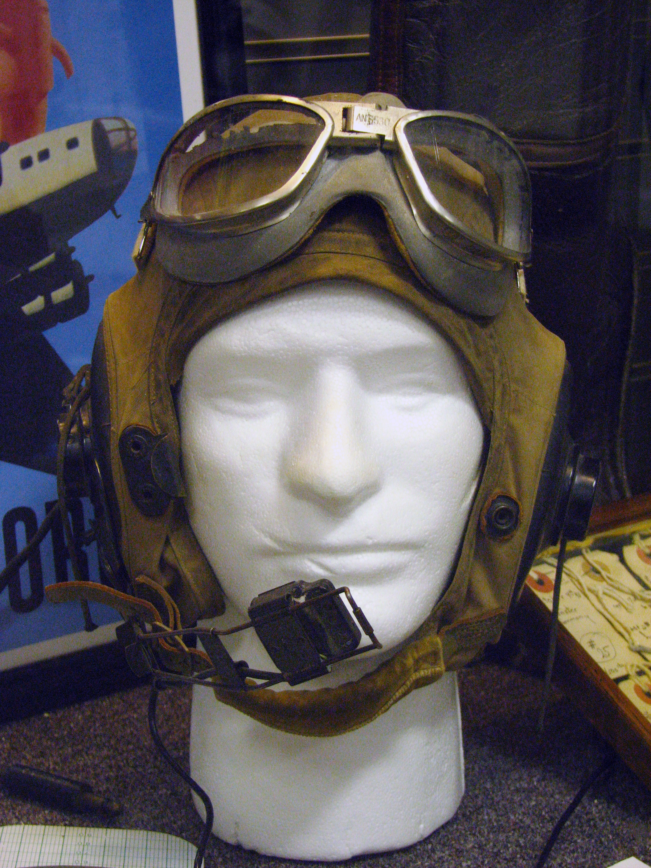
I started off looking at aviation headgear. I particularly like the image below, Depa has already given me some textures she wants me to base the texturing around for Jack, our character, however they are only loose representations of what she wants. I particularly like the fur hat, it gives the model a nice old aviator style look, which will fit in very well to what i am trying to achieve.
I am querying whether to have the fur hat combines with a leather texture, like tradittional aviation headgear, or with a camouflage texture, which will fit in with the whole idea of Jack being an 'army' type guy, flying his biplane.


The jump suits above are the sort of things i am looking to base the textures of Jack around, they are a great piece of research which i found, i had a picture of what i want Jack to look like in my head, and finding this image has really secured my idea, i will have the camouflage legs, with a Khaki colored top, or jacket. This will really give jack the desired look of what i am going for in terms of army man.
These images, are a coupe of pieces i found when researching traditional aviation gear. The model that Depa has produced really fits into the idea of keeping the whole textures very traditional colours and allowing them to fit in with the type of model. I would like to use dark browns, khaki, and camouflage colours in the texturing process, as they are the traditional colours of the army.

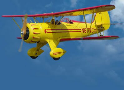
After researching colours and styles for my texturing, i decided to look towards the model and texture of the biplane. The first thing that struck me when i came across images of biplanes on the internet, is their striking bright colours. This gave me the intention to keep whatever textures i placed on the biplane to be consistently bright, i also wanted to add a personal touch to the model, so decided to texture it using the Ravensbourne colours and logo, before the change, which is when i produced the model, or Red and black.
I think the research i have gathered helped me a great deal in terms of knowing what a biplane looks like to accurately model and texture my own plane.

Below is an image of a traditional Write brothers style biplane. I am not sure i want to make a plane in this style, it looks very old school and i was intending on making my plane a little more modern, with brighter colours, made of panneled alluminium rather than wood.
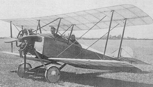
I found the image below and it helped me a great deal in getting the right shape of the biplane in the modelling process. I like the mid range style of the biplane, it don't look too old fashioned, and it don't look too modern, it fits in well with style of the rest of the scene we are going to be producing, with the somewhat old fashionel aviation pilot, and windmill.


After researching the obvious things which would help me in terms of texturing and modeling, i turned my attentions on focusing on the style of the piece. One day on the ride home from college, me Depa and Josh were discussing how we could improve our final piece once we got roudn to adding effects, and we came up with the idea of giving the piece a very old styled film reel effect, like you used to see in old silent movies. We also wanted to look at sound and have a very upbeat and jaunty feel to the whole thing, again like you see in traditional silent movies. We also come up with the prospect of having cut scenes between parts of our animation to tell our story in text format.
I went on to look at examples of films on youtube that inspired me and the types of sound and imagery we are looking for.
I came across this piece whilst researching on Youtube, i found the sound very interestng and similar to what we are looking for. I want our film to focus on having an upbeat and jaunty sound to go along with our cut scenes and old film-look.
This clip taken from Un Chien Analou.i included as i have studied the film before, and thought it was a great example of the use of contrapuntal sound in a silent movie used to create effect. The music in this piece helps create that added suspense building up to the release of the clip. I included this in my research to show that music can help our story alone, especially now that we are focusing on a silent movie, the sound is vitally important, the job of sorting out sound has gone to Josh.
Real 8mm film footage
I included this in my research to show what i intended to use as the overlay to our final film, i can easily add this effect to our whole film in after effects. This gives the piece a great old-feel which is exactly what we are aiming for.
The sepia look to the piece below, combined with the 8mm film reel effect, is very similar to what we are looking for. This effect gives the film a very old feel, and along with the sound, it is really effective in portraying the time frame the movie is form.
I started off looking at aviation headgear. I particularly like the image below, Depa has already given me some textures she wants me to base the texturing around for Jack, our character, however they are only loose representations of what she wants. I particularly like the fur hat, it gives the model a nice old aviator style look, which will fit in very well to what i am trying to achieve.
I am querying whether to have the fur hat combines with a leather texture, like tradittional aviation headgear, or with a camouflage texture, which will fit in with the whole idea of Jack being an 'army' type guy, flying his biplane.
The jump suits above are the sort of things i am looking to base the textures of Jack around, they are a great piece of research which i found, i had a picture of what i want Jack to look like in my head, and finding this image has really secured my idea, i will have the camouflage legs, with a Khaki colored top, or jacket. This will really give jack the desired look of what i am going for in terms of army man.
These images, are a coupe of pieces i found when researching traditional aviation gear. The model that Depa has produced really fits into the idea of keeping the whole textures very traditional colours and allowing them to fit in with the type of model. I would like to use dark browns, khaki, and camouflage colours in the texturing process, as they are the traditional colours of the army.
After researching colours and styles for my texturing, i decided to look towards the model and texture of the biplane. The first thing that struck me when i came across images of biplanes on the internet, is their striking bright colours. This gave me the intention to keep whatever textures i placed on the biplane to be consistently bright, i also wanted to add a personal touch to the model, so decided to texture it using the Ravensbourne colours and logo, before the change, which is when i produced the model, or Red and black.
I think the research i have gathered helped me a great deal in terms of knowing what a biplane looks like to accurately model and texture my own plane.
Below is an image of a traditional Write brothers style biplane. I am not sure i want to make a plane in this style, it looks very old school and i was intending on making my plane a little more modern, with brighter colours, made of panneled alluminium rather than wood.
I found the image below and it helped me a great deal in getting the right shape of the biplane in the modelling process. I like the mid range style of the biplane, it don't look too old fashioned, and it don't look too modern, it fits in well with style of the rest of the scene we are going to be producing, with the somewhat old fashionel aviation pilot, and windmill.
After researching the obvious things which would help me in terms of texturing and modeling, i turned my attentions on focusing on the style of the piece. One day on the ride home from college, me Depa and Josh were discussing how we could improve our final piece once we got roudn to adding effects, and we came up with the idea of giving the piece a very old styled film reel effect, like you used to see in old silent movies. We also wanted to look at sound and have a very upbeat and jaunty feel to the whole thing, again like you see in traditional silent movies. We also come up with the prospect of having cut scenes between parts of our animation to tell our story in text format.
I went on to look at examples of films on youtube that inspired me and the types of sound and imagery we are looking for.
I came across this piece whilst researching on Youtube, i found the sound very interestng and similar to what we are looking for. I want our film to focus on having an upbeat and jaunty sound to go along with our cut scenes and old film-look.
This clip taken from Un Chien Analou.i included as i have studied the film before, and thought it was a great example of the use of contrapuntal sound in a silent movie used to create effect. The music in this piece helps create that added suspense building up to the release of the clip. I included this in my research to show that music can help our story alone, especially now that we are focusing on a silent movie, the sound is vitally important, the job of sorting out sound has gone to Josh.
Real 8mm film footage
I included this in my research to show what i intended to use as the overlay to our final film, i can easily add this effect to our whole film in after effects. This gives the piece a great old-feel which is exactly what we are aiming for.
The sepia look to the piece below, combined with the 8mm film reel effect, is very similar to what we are looking for. This effect gives the film a very old feel, and along with the sound, it is really effective in portraying the time frame the movie is form.
The Idea
We have started brainstorming, and we have come up with a few idea. We looked at very simple ideas to begin with, due to the lack of time we have, and come up with a few ideas about moving blocks and animating them as if they are characters, giving them a persona. However, we realised we would have to drag this out over at least 30 seconds, and we decided to discount this idea due to the lack of potential ideas relating to the characters, and we saw these more suitable if we were doing a short 10 second ident. We then decided that we wanted to focus on a character having an interesting experience, so that we could have a nice mix of animation and visual aesthetics in terms of the character design and environment.
We started brainstorming, and came up with a few concepts, however we decided upon focusing our animation upon a character called Jack. He is a pilot, and one day he takes his plane for a spin, however he runs into trouble when a bird flies into his plane, and he is forced to eject the cockpit, and float to the ground on a parachute. My initial feelings about the idea are that the parachute could be a great place within the scene to harbour the Rave live Logo.
I feel this idea gives us a great mix of character, environment design as well as a good potential for nice animation.
Schedule

Above is the schedule i have made in order for me to get the work completed. This schedule does not include the showreel project, as that will be an ongoing process throughout the 8 weeks of term. I have ended the term at 5 weeks which is the Rave Live DEADLINE.
I think we will be pushed to get everything finished in time, taking from past experiences, modelling and Texturing have taken longer than predicted, however with this very tight deadline there is very little room for time expansions in either of these areas.
EDIT:
I have included the actual schedule that took place. This is how the project panned out. We were not able to get the project done in time for Rave live, however, we were able to get it done for submission before the end of term. I am rather disappointed at this. Looking at the schedules, our obvious pitfalls were the modeling of the character that took longer than expected, and the texturing which was delayed too long. Also, we again left the animation till a very late date, which i am angry at because i thought i would have learned form that in past experiences.
Brief
The brief for this project is slightly different to anything we have done before, we have to select from a few options, including producing some work for the 3rd year BA students, working on their final films, produce an animation ident or an animation short up to broadcast standards to be shown at Rave Live, or find an external client and produce a promotional short animation which fits into their business model. We have decided to form a group of me, Depa and Josh, we know we all work well together from experiences we had last term working together on a previous project.
The first initial idea that stood out to us was the Rave Live work, we see it as a great opportunity to get our work seen by the industry, as well as a good opportunity to push our skills to the limit and see what we are capable of. We have decided upon producing a short animation of around 30 seconds to be used as a Rave live piece. The piece must comply with broadcast standards, and must have the correct aspect ratio, and clock/bars at the beginning of the film along with the title and time codes.
The deadline for this project is before the end of term so we know we are really going to have to push ourselves if we are going to get this finished in 4-5 weeks.
Subscribe to:
Posts (Atom)