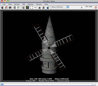
The windmill i decided to texture using very traditional white/light brick. I wanted to keep it in sync with the rest of the piece. I am happy with the outcome of these textures, i feel the neutral colous of grey and brown work very well to keep it within the time period of the biplane.

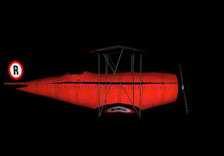
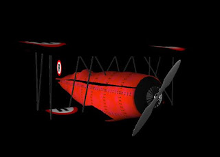
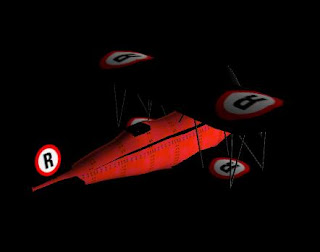
the textures of the biplane were a little different to the rest of my textures. I wanted to add a personal touch to the biplane as it would be the main focus of the scene. i decided to add the Ravensbourne logo to the plane, before the logo change which came after i had produced the plane. I wanted to keep the plane bright colours in consistency with my research, and keep it in running with the colours of the Ravensbourne logo, so the obvious choice for colour was red.
With most of the biplanes i saw from my research, i saw they were constructed with metal panels, fixed together with screws, so i decided to replicate this effect within my texturing. I feel the aesthetic outcome of the piece is a good one, and i am very happy with it.
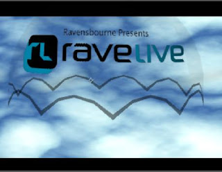
I created the parachute with the Rave Live logo on it, i thought this would be the obvious way of promoting the event within our animation, as it would be such a large and pivotal image on the screen during our scene, drawing the main focus of attention to it. I created it using a transparent layer in photoshop, which i then applied as a texture in Maya, i made the trim of the parachute translucent to give it some obvious shape as a parachute.
This was my first experience of using alpha channels as textures and i am happy with the outcome of the textures, i feel it gives the parachute a nice look to it, with also a cartoony added aspect which matches the character design.
No comments:
Post a Comment